[CSS] transition, animation, transform
transition
: CSS에서 수치로 구현하는 속성들의 값이 전환되는 과정을 보여주는 애니메이션
★
트랜지션의 대상이 될 수 있는 CSS 프로퍼티 :
[Box model]
- width height, max-width, max-height, min-width, min-height
- padding, margin
- border-color, border-width, border-spacing
[Background]
- background-color, background-position
[좌표]
- top, left, right, bottom
[텍스트]
- color font-size, font-weight, letter-spacing, line-height
- text-indent, text-shadow, vertical-align, word-spacing
[기타]
- opacity, outline-color, outline-offset, outline-width
- visibility, z-index
🎨 transition / transform / animation 속성 사용법
CSS 트랜지션 트랜지션(transition)은 CSS 프로퍼티의 값이 변화할 때, 프로퍼티 값의 변화가 일정 시간(duration)에 걸쳐 일어나도록 하는 것이다. 상태 변화에 동반하여 변경되는 CSS 프로퍼티 값에 의
inpa.tistory.com
| 속성 | 설명 |
| transition-property | 전환되는 속성을 지정 |
| transition-duration | 전환되는 전체 시간을 지정 |
| transition-delay | 전환되는 시점까지의 지연시간을 지정 |
| transition-timing-function | 전환되는 속도를 지정 |
사용예시)
<!DOCTYPE html>
<html lang="en">

<head>
    <meta charset="UTF-8">
    <meta http-equiv="X-UA-Compatible" content="IE=edge">
    <meta name="viewport" content="width=device-width, initial-scale=1.0">
    <title>transition</title>
    <style>
        div img {
            width: 200px;

            /* transition-property: width;
            transition-duration: 0.3s;
            transition-delay: 0s;
            transition-timing-function: cubic-bezier(0.36, 0, 0.66, -0.56); */

            /* transition: width 0.3s 0s cubic-bezier(0.36, 0, 0.66, -0.56); */

            transition: 0.3s cubic-bezier(0.36, 0, 0.66, -0.56);
        }

        div img:hover {
            width: 400px;
        }
    </style>
</head>

<body>
    <div>
        <img src="imgs/pet1.jpg" alt="">
    </div>
</body>

</html>
- transition-duration과 transition-delay은 시간을 입력하는 속성이고,
- 순서는 반드시 transition-duration이 먼저 작성되어야 한다.
- all과 delay값(값이 없다면)은 생략가능함
transition 속도 모델 참고 사이트
Easing Functions Cheat Sheet
Easing functions specify the speed of animation to make the movement more natural. Real objects don’t just move at a constant speed, and do not start and stop in an instant. This page helps you choose the right easing function.
easings.net
animation
: 기본적으로 해당 페이지가 로드되자마자 작동하는 애니메이션 효과를 만들 수 있다.
| 속성 | 설명 |
| animation-name | 애니메이션 이름 |
| animation-duration | 애니메이션 전체 시간 |
| animation-delay | 애니메이션 지연시간 |
| animation-timing-function | 애니메이션 속도 |
| animation-iteration-count | 애니메이션 회수 (숫자 또는 infinite) |
| animation-fill-mode | 애니메이션 시작 또는 종료 후의 위치 지정 진행방향에서 멈추게 함 (사용예시에서는 바뀐 컬러인 lightgreen에서 멈추게 함) |
| animation-direction | 애니메이션 진행 방향 - 값 normal, reverse alternate : 순방향 후 역방향 alternate-reverse : 역방향 후 순방향 |
사용예시1)
<!DOCTYPE html>
<html lang="en">

<head>
    <meta charset="UTF-8">
    <meta http-equiv="X-UA-Compatible" content="IE=edge">
    <meta name="viewport" content="width=device-width, initial-scale=1.0">
    <title>Animation</title>
    <style>
        .box {
            width: 100px;
            height: 100px;
            background: lightsalmon;
            /*
            animation-name: changecolor;
            animation-duration: 2s;
            animation-delay: 1s;

            animation-fill-mode: forwards;
            animation-iteration-count: infinite;
            animation-direction: alternate; 축약하면 아래와 같다.*/

            animation: changecolor 2s 1s forwards infinite alternate;
        }

        @keyframes changecolor{
            0%{
                background: lightsalmon;
            }
            50%{
                background: lightblue;
            }
            100%{
                background: lightseagreen
            }
        }
    </style>
</head>

<body>
    <div class="box">box</div>
</body>

</html>
사용예시2) 페이지가 열리면(새로고침) 순차적으로 나타나는 애니메이션 만들기
<!DOCTYPE html>
<html lang="en">

<head>
    <meta charset="UTF-8">
    <meta http-equiv="X-UA-Compatible" content="IE=edge">
    <meta name="viewport" content="width=device-width, initial-scale=1.0">
    <title>Animation</title>
    <style>
        header >*{
            position: relative;
            opacity: 0;
            top: 40px;
            animation: fadeUp 0.5s forwards;
        }
        header h1{
            animation-delay: 0.1s;
        }
        header p{
            animation-delay: 0.2s;
        }
        header a{
            animation-delay: 0.3s;
        }
        @keyframes fadeUp{
            from{
                opacity: 0; top: 40px
            }
            to{
                opacity: 1; top: 0
            }
        }
    </style>
</head>

<body>
    <hr>
    <header>
        <h2>Main title</h2>
        <p>
            description
        </p>
        <a href="">read more</a>
    </header>
    <hr>
</body>

</html>
주의사항 : header요소 뒤 hr 태그는 움직이면 안되므로 position을 이용해 top 값으로 위로 올라오게 했다.
(margin, transform을 이용하는 방법도 있음)
★
animation은 페이지가 열리자마자 작동하는 것이 기본이지만,
transition처럼 hover와 같은 마우스 이벤트 또는 특정 클래스명이 있을 때 작동하도록 응용할 수 있다.
ex) box.hover { animation changecolor 2s 1s forwards infinite alternate; }
transform
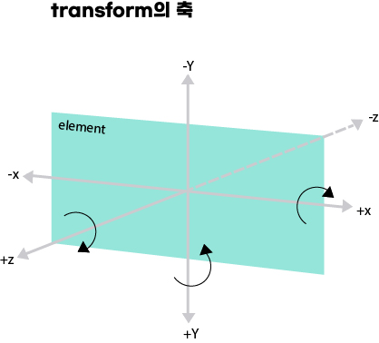
: 다른 요소들의 위치에 영향을 주지 않고 이동, 축소, 확대, 회전, 비틀기 등을 적용할 수 있다.
웹페이지는 3차원이다.
양수는 오른쪽, 아래쪽, 앞쪽으로 이동
음수는 왼쪽, 위쪽, 뒤쪽으로 이동
| 속성 | 설명 | 예시 |
| translateX(수치) translateY(수치) translateZ(수치) translate(x, y) |
가로 방향(x)으로 이동 세로 방향(y)으로 이동 앞뒤로(z) 이동 가로방향, 세로방향으로 이동 |
transform: translateX(30px); transform: translateY(30px); transform: translateZ(30px); transform: translate(30px, 30px); |
| scale(수치) scale(x, y) scaleX(x) scaleY(y) scaleZ(z) |
가로, 세로 동일하게 크기를 변환 가로 ,세로 크기를 변환 가로 크기를 변환 세로 크기를 변환 앞뒤 크기를 변환 |
transform: scale(1.5); transform: scale(1.5, 2); transform: scaleX(2); transform: scaleY(1.5); |
| rotate(angle) rotateX(angle) rotateY(angle) |
지정한 각도로 회전 x축을 기준으로 회전 y축을 기준으로 회전 |
transform: rotate(30deg); transform: perspective(500px) rotateX(30deg); transform: perspective(500px) rotateY(30deg); |
| skewX(angle) skewY(angle) skew(x-angle, y-angle) |
x축을 기준으로 비틀기 y축을 기준으로 비틀기 x, y축을 기준으로 비틀기 |
transform: skewX(30deg); transform: skewY(30deg); transform: skew(30deg, 45deg); |
| perspective(n) : 원근감 |
원근감을 부모 요소에 지정하기 원근감을 해당 요소에 직접 지정하기 |
perspective: 1000px; transform: perspective(1000px) roateX(45deg); |
사용예시)
<!DOCTYPE html>
<html lang="en">

<head>
    <meta charset="UTF-8">
    <meta http-equiv="X-UA-Compatible" content="IE=edge">
    <meta name="viewport" content="width=device-width, initial-scale=1.0">
    <title>transform</title>
    <style>
        figure {
            text-align: center;
            margin: 5rem auto;
        }

        img {
            transition: 0.4s;
        }

        .translate:hover img{
            transform: translate3d(50px, 50px, 100px);
        }

        .translate{
            perspective: 1000px;
            perspective-origin: 0 0;
        }

        .scale img{ /* scale 값이 변경(이미지가 커지는)되는 기준점을 왼쪽 하단으로 변경한다.
                       기본 기준점은 이미지의 정가운데.*/
            transform-origin: 0 100%;
        }
        .scale:hover img{
            transform: scale(1.3);
        }

        .rotate:hover img{ /* perspective값(원근감)과 함께 이용하면 더 역동적임!*/
            transform: perspective(500px) rotateY(45deg);
        }
    </style>
</head>

<body>
    <h1>transform</h1>
    <h2>translate</h2>
    <figure class="translate">
        <img src="핑크양.jpg">
        <figcaption>
            photo description
        </figcaption>
    </figure>
    <hr>
    <h2>scale</h2>
    <figure class="scale">
        <img src="루피.jpg">
        <figcaption>
            photo description
        </figcaption>
    </figure>
    <hr>
    <h2>rotate</h2>
    <figure class="rotate">
        <img src="운전짱구.jpg">
        <figcaption>
            photo description
        </figcaption>
</body>

</html>